01. Overview
Kots Renting Pvt. Ltd., popularly known as Kots World, is a rental startup based in Bengaluru, India. Their business model revolves around simplifying the rental process for both property owners and tenants. They partner with property owners by leasing entire buildings, transforming these spaces into fully furnished and well-decorated homes, and then renting them out to individuals and families. This approach ensures that tenants get move-in-ready accommodations without the hassle of setting up a new home, while property owners benefit from a steady rental income without worrying about maintenance or finding tenants themselves.
02. Problem
"Kots World relies on its website for flat bookings, but their previous website was ineffective and did not generate enough reservations. Many users found the booking process too long and confusing, making it difficult for them to complete their reservations. Additionally, some customers expressed concerns about the website’s credibility, as it lacked essential details about the flats and apartments. The absence of clear, valuable information made it hard for potential renters to trust the platform, ultimately leading to lower engagement and fewer bookings."
1. Inefficient Booking Process
Many users found the booking process overly complicated and time-consuming, leading to frustration and
abandoned bookings.
2. Lack of Essential Property Information
Users couldn’t find essential information
like prices, amenities, or floor plans, making it hard to decide.
3. Trust and Credibility Issues
The site felt untrustworthy due to missing details,
unclear terms, and a lack of high-quality images or reviews.
4. Low User Engagement
A clunky design and navigation problems made it difficult for
users to browse and book smoothly.
Because of the website’s inefficiencies, Kots World struggled to generate the expected number of bookings. A smoother, more user-friendly platform with clearer property details and a transparent process could significantly improve conversion rates and business growth.
03. User Research & Current Website Walkthrough
Firstly, I conducted a comprehensive audit of Kots World's booking website and user flow. My goal was to identify what worked well, pinpoint areas needing improvement, and implement solutions that benefited both users and the business.
After that, To gain a deeper understanding of the user experience, I conducted random interviews with current tenants to learn about their challenges in finding and booking apartments. I asked them about their past experiences with renting flats or other items online and the difficulties they faced in the process.
Additionally, I consulted the sales team, who regularly assist potential customers, to gather insights into common user pain points and navigation issues. Their feedback helped identify key obstacles that made the booking process confusing or frustrating for users.
1. Difficult Apartment Search
Users couldn’t filter available apartments by location or area , making it hard to find
relevant options. The lack of a clear search system frustrated users and slowed down the
process.
2. Limited Property Information
The website provided minimal details about flats and buildings, leading users to
distrust the listings. Without enough information, potential renters hesitated to move
forward with bookings.
3. Hidden Pricing & Lack of Transparency
Users couldn’t see the full amount they needed to pay until they completed the booking
form. This lack of upfront pricing created uncertainty and discouraged bookings.
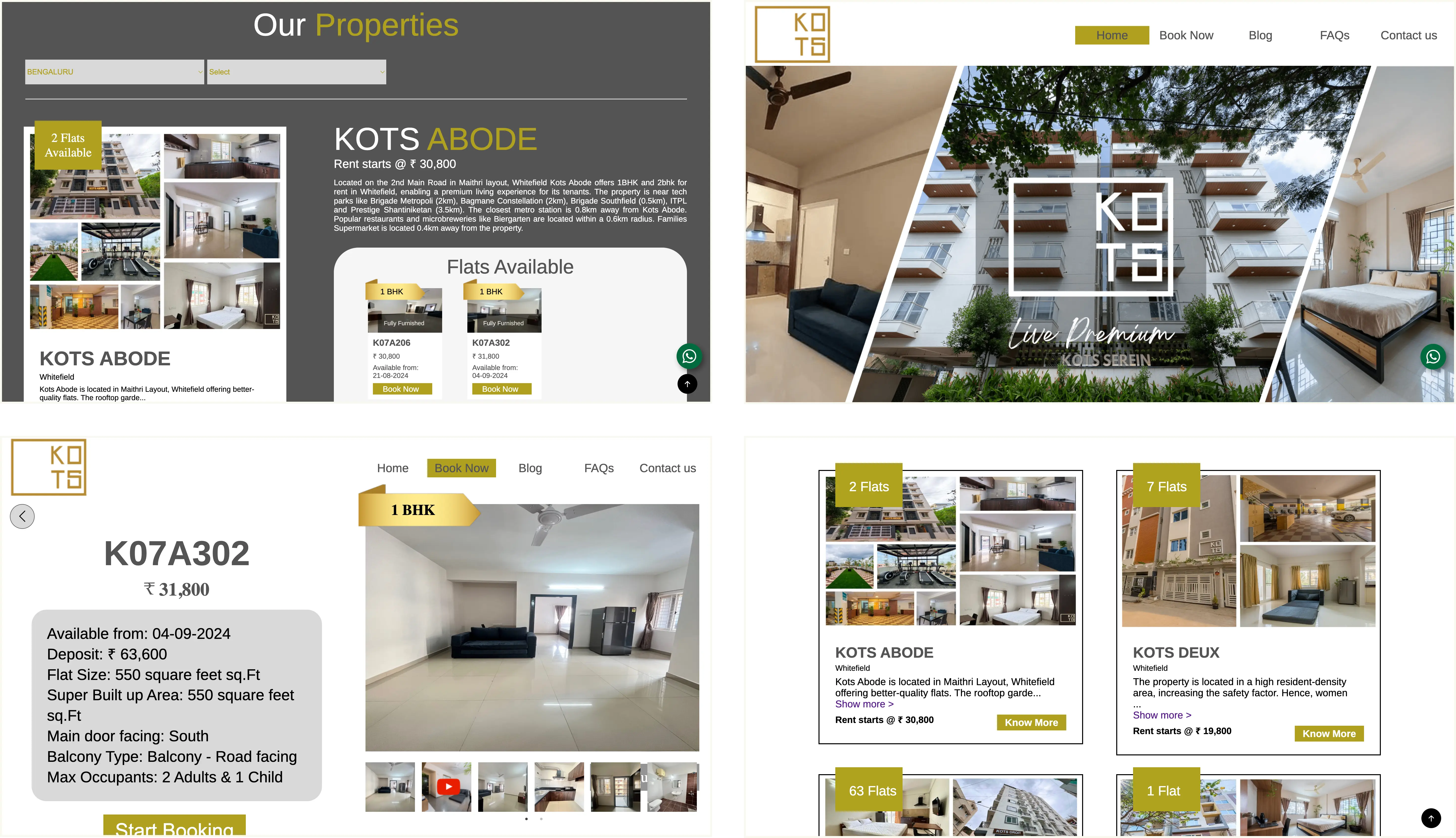
These are the previous designs for the Website.
The old website was confusing to navigate because it lacked a clear layout, and important information was scattered everywhere. Key details like carpet area, amenities, and move-in charges were hidden under FAQs or buried in tabs, making them almost useless unless users spent over 15 minutes searching for them. This poor organization frustrated potential renters and made the booking process unnecessarily difficult. A more structured, easy-to-read design with all essential details upfront would greatly improve the user experience.
To ensure my findings were accurate, I analyzed similar platforms like Housing.com, Stanza Living, Zolo Living, Airbnb, Zillow, Trulia, and Apartments.com. I studied their features, how users interacted with their websites, and their overall functionality. This helped me identify industry best practices and key elements that build trust and make the booking process easier for users.
04. Solution & Hi-Fi Responsive Design
Based on extensive tenant feedback and business requirements, I identified and prioritized three major problems that needed to be addressed. By analyzing user pain points and understanding what mattered most to both renters and the business, I focused on improving the following 3 major problems.
1. Making Apartment Search Easy
Finding the right apartment was confusing and time-consuming. I worked on creating a smooth and simple search flow, so users could easily filter, explore, and find listings without frustration.
2. Building Trust with Clear Information
Many users felt unsure about booking because important details like pricing, amenities, and fees weren’t clearly visible. To fix this, I made sure all key information was upfront and easy to understand, so users knew exactly what they were getting.
3. Simplifying the Booking Process
The old system asked for too much unnecessary information, making it frustrating to complete a booking. I streamlined the process by removing extra steps and fields, keeping it quick, simple, and hassle-freee for users.
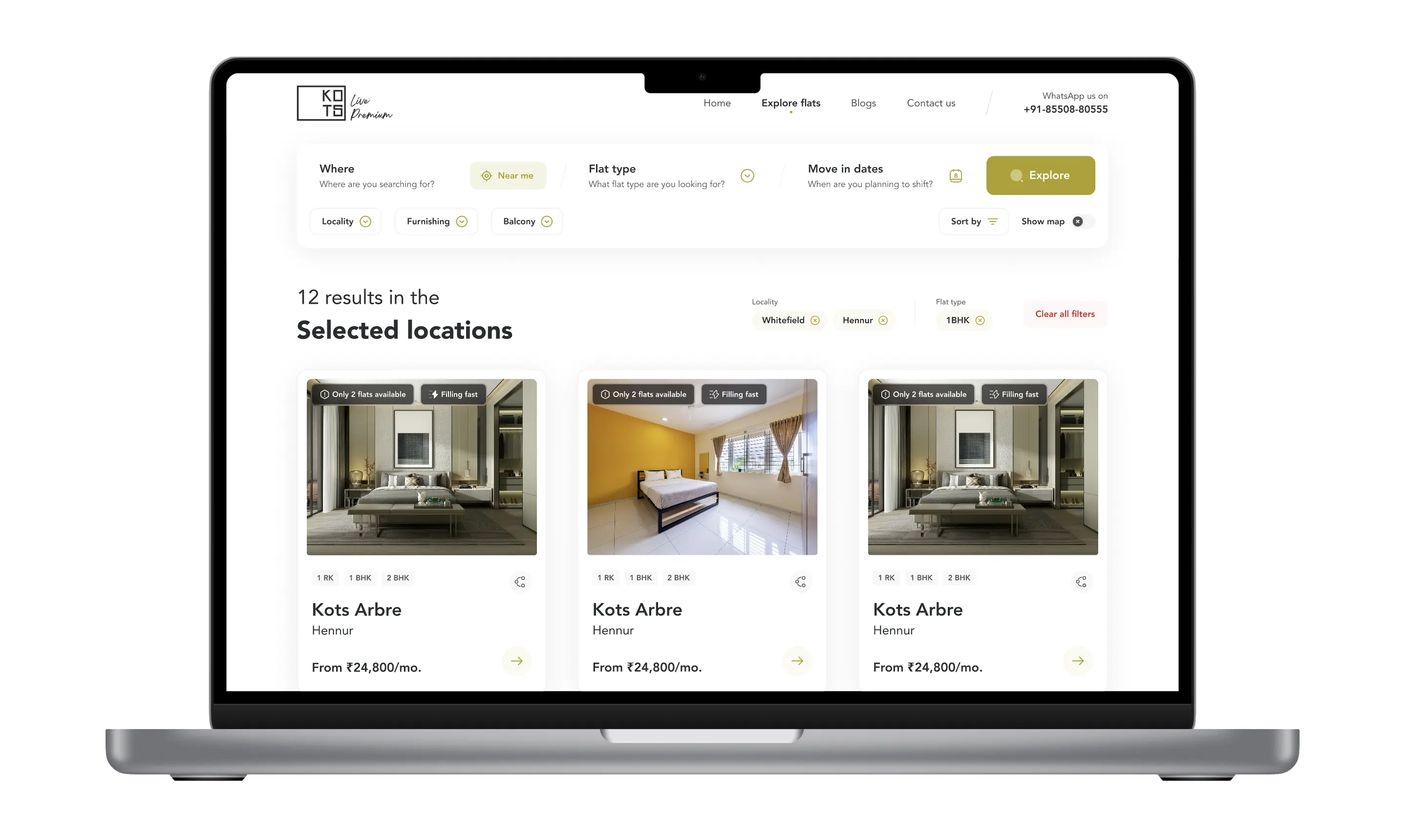
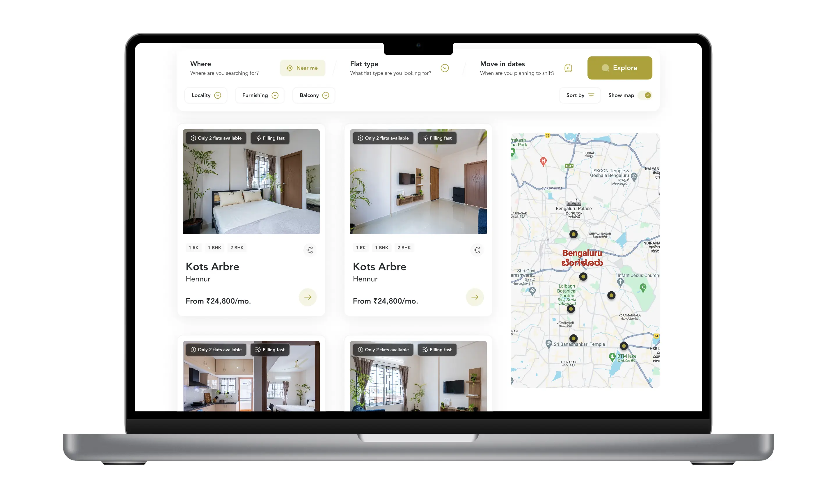
Users can now easily filter apartments based on location, flat size, move-in dates, and other key preferences, helping them find options that best suit their needs. Additionally, they can search based on their current location or office address, making it more convenient to discover nearby rentals. To enhance the experience further, a map view has been added, allowing users to visually explore properties, see their exact locations, and make more informed decisions.
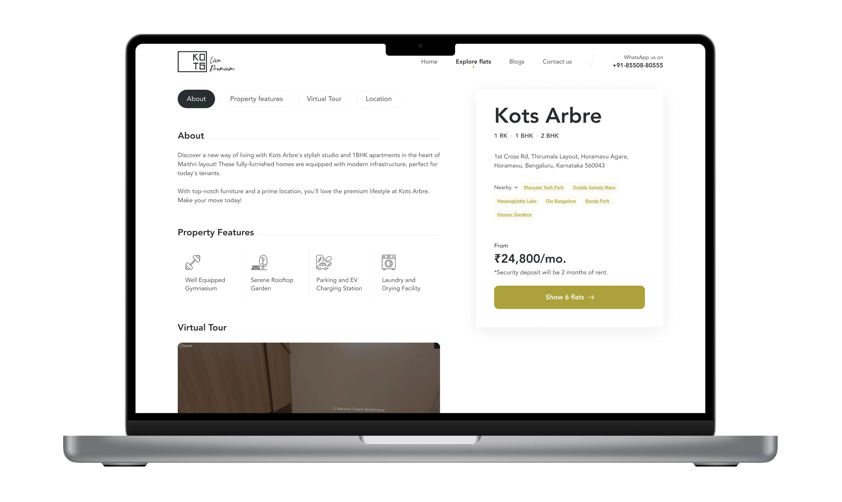
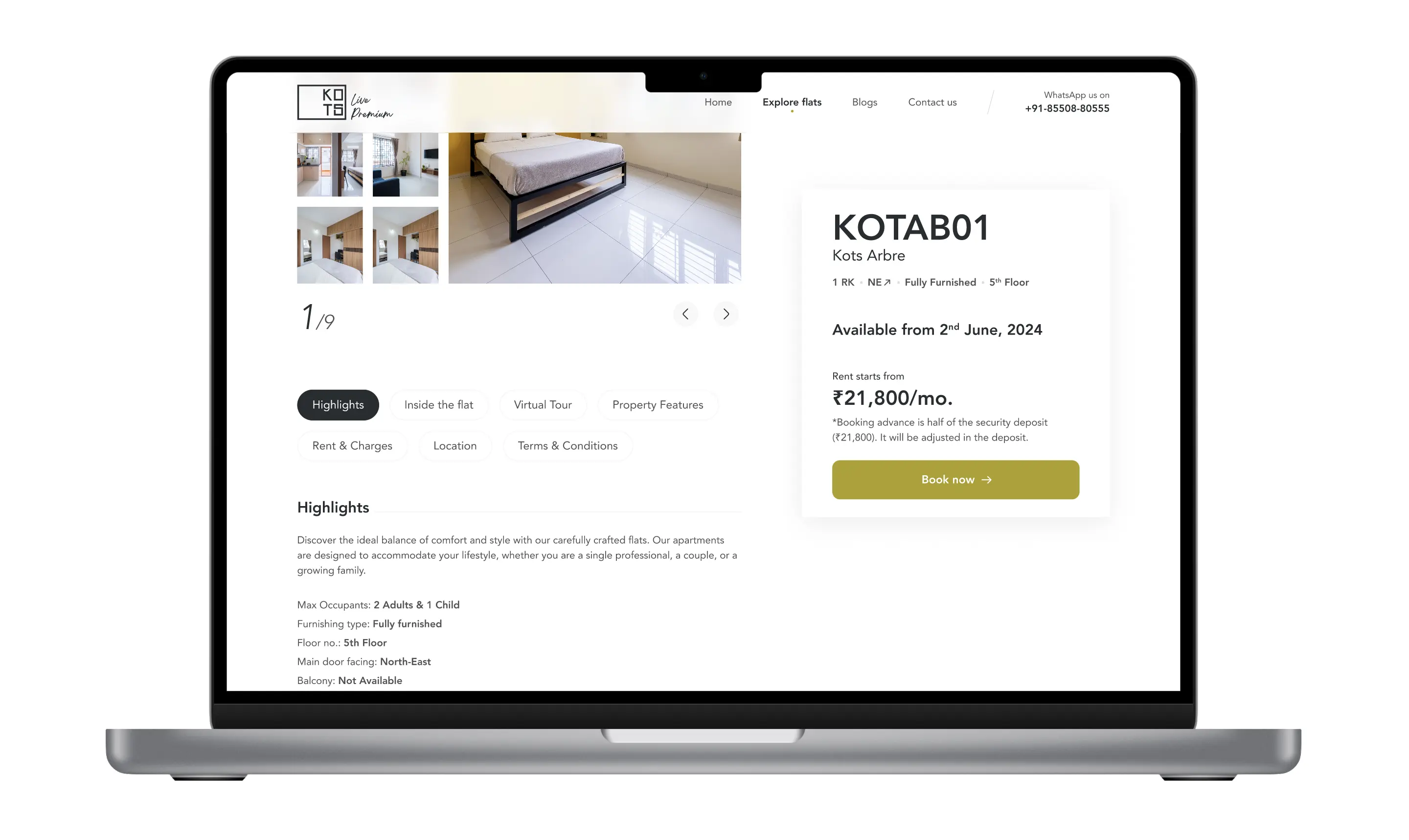
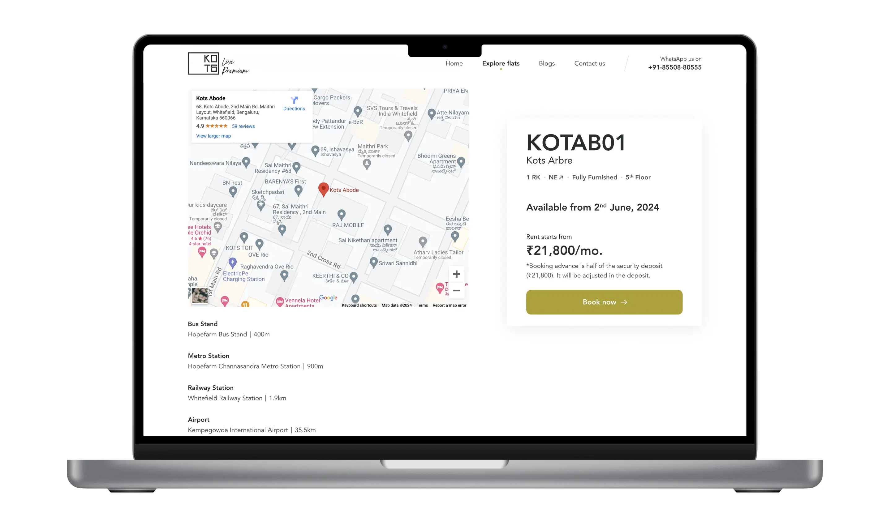
Each apartment listing now includes detailed information on amenities, pricing, and building details, ensuring renters have everything they need to make an informed decision. Terms and conditions are clearly displayed with no hidden fees, so users know exactly what to expect. To build trust, tenant reviews and media features have been added, showcasing real experiences and company credibility.
Customer support is now more accessible, allowing users to quickly reach out to sales teams or offices for assistance.

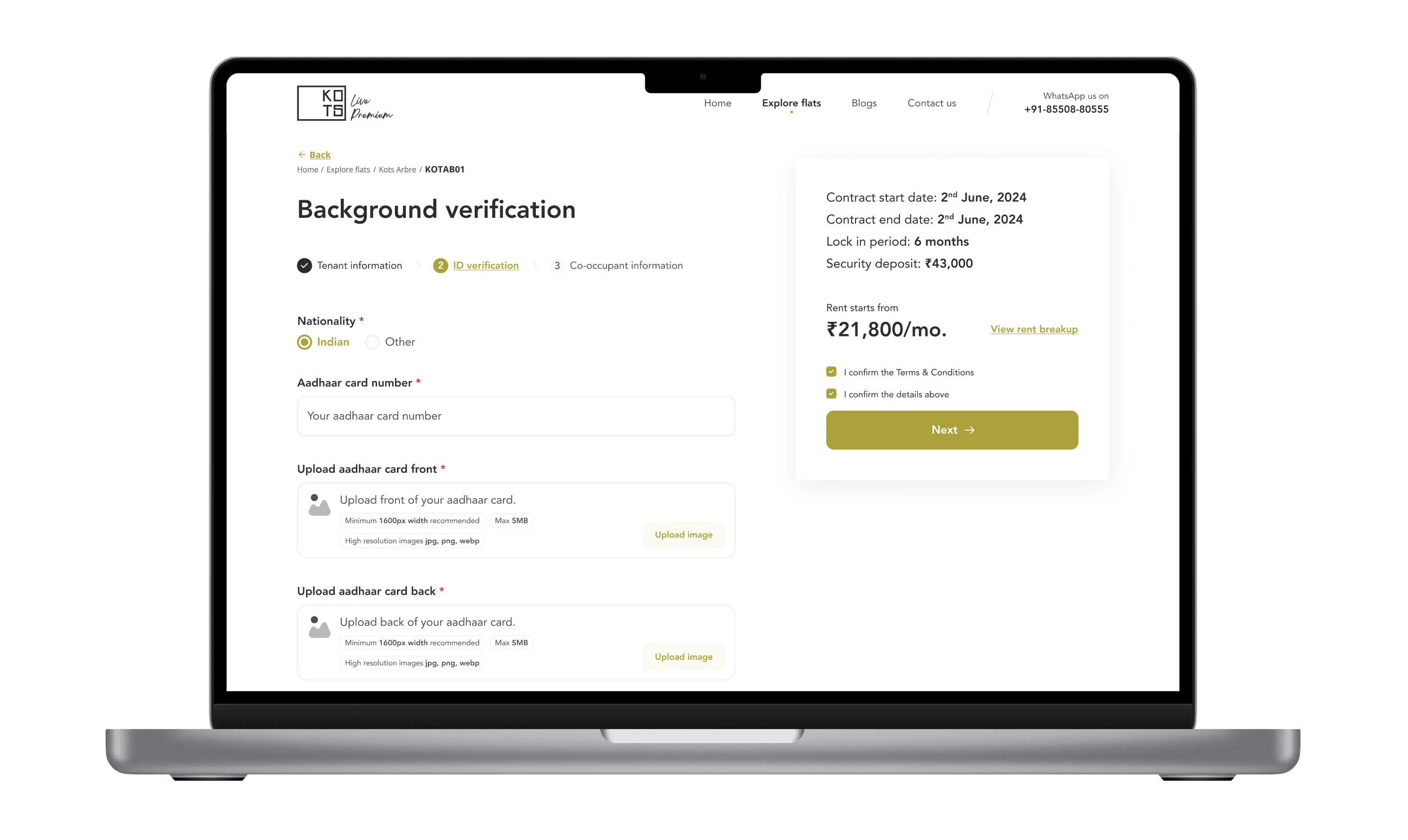
The form is now split into three simple steps, with fewer fields to make it quick and easy for users to complete in under five minutes. At the same time, it ensures that the business collects only the most essential information about renters, keeping the process efficient for both sides.
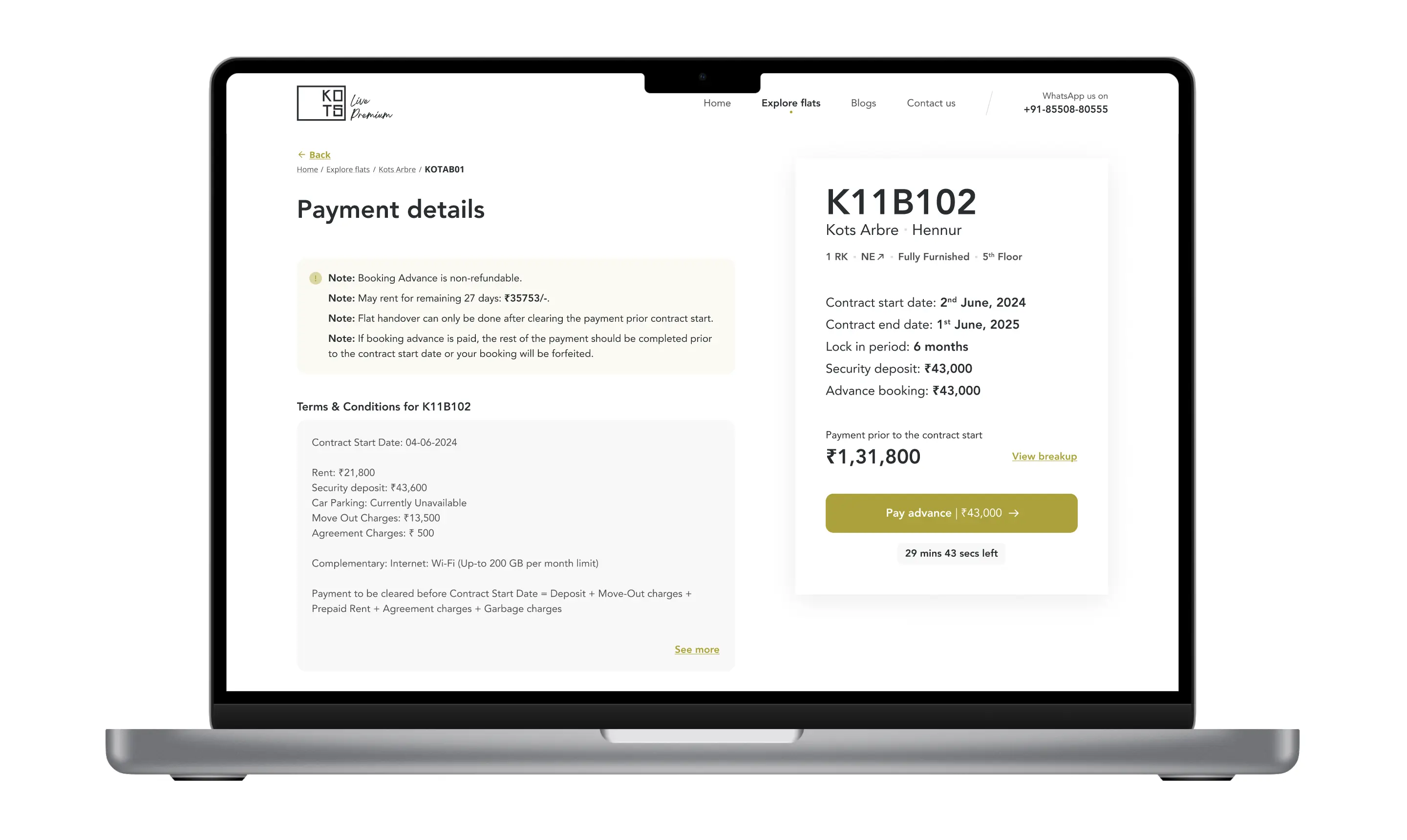
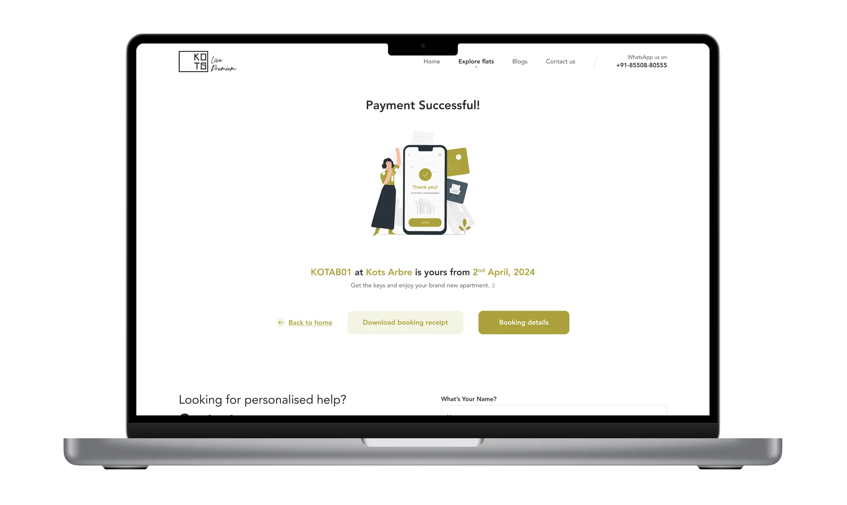
To ensure clarity and transparency, all essential but complex information is clearly presented to users before they make a payment, so there are no surprises. Additionally, a booking confirmation page has been introduced, allowing users to download their invoice or review their booking details anytime for future reference.
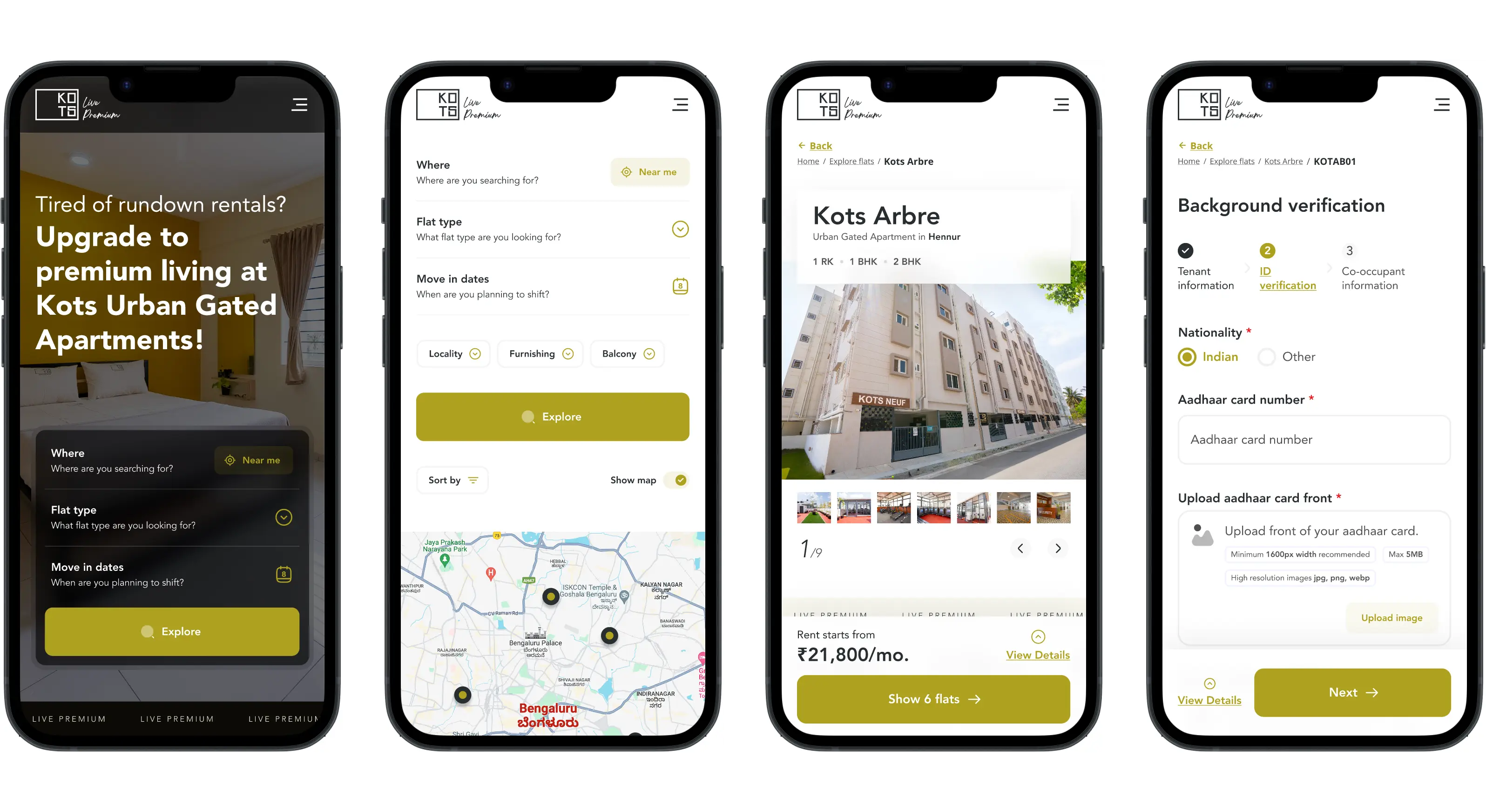
With 70% of bookings coming from mobile, the design was made fully responsive for a smooth experience on all devices.
Many users felt unsure about booking because important details like pricing, amenities, and fees weren’t clearly visible. To fix this, I made sure all key information was upfront and easy to understand, so users knew exactly what they were getting.
The old system asked for too much unnecessary information, making it frustrating to complete a booking. I streamlined the process by removing extra steps and fields, keeping it quick, simple, and hassle-freee for users.
Customer support is now more accessible, allowing users to quickly reach out to sales teams or offices for assistance.
05. Key Takeaways & Future Possibilities
1. Put Users First. A great design starts with understanding what users struggle with. Gathering direct feedback and research helps create solutions that truly make their experience easier and more enjoyable. The smoother and more intuitive the platform, the more likely users will stay and complete their journey.
2. Clarity and Transparency Build Trust. Users hesitate to commit when essential information is hidden or unclear. Providing clear, upfront details about pricing, amenities, and policies improves confidence and increases conversions.
3. Simplification Enhances Usability. Overcomplicated forms and unnecessary steps create frustration and drop-offs. Keeping processes minimal, efficient, and user-friendly leads to higher engagement and faster bookings.
Discover case studies